
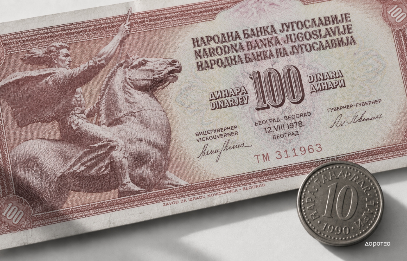
The State in Your Pocket: The Design of Yugoslav Banknotes and Coins
Pročitaj tekst na srpsko-hrvatskom!
Yugoslav banknotes and coins represent one of the more fascinating micro-histories of Yugoslav design. From Partisans and workers in the immediate aftermath of the Second World War, through industry, culture and non-alignment, to Tesla, Andrić and anonymous young faces on the eve of the country’s dissolution, the appearance of the Yugoslav dinar changed along with the state itself.
Money is one of the most widely circulated products of graphic design. Unlike posters, books or magazines, banknotes and coins pass through almost everyone’s hands. Their appearance is therefore more than an aesthetic matter: through its choice of portraits, symbols, typography, colours and motifs, a state says something about itself.
In socialist Yugoslavia, this visual language changed along with society. Money became a kind of miniature history of the country, but also an everyday object through which ideas of revolution, labour, modernisation, unity, culture and progress were disseminated.
The First Yugoslav Banknotes: The Partisan as a Symbol of the New State
The first banknotes of Democratic Federal Yugoslavia, issued in 1944, were explicitly political. Their design was created by Đorđe Andrejević Kun, with the same figure of an armed Partisan appearing on every denomination. The new state thus presented itself through its own revolutionary origins: the Partisan was not a specific individual, but a typified figure of the fighter and a symbol of the National Liberation Struggle.
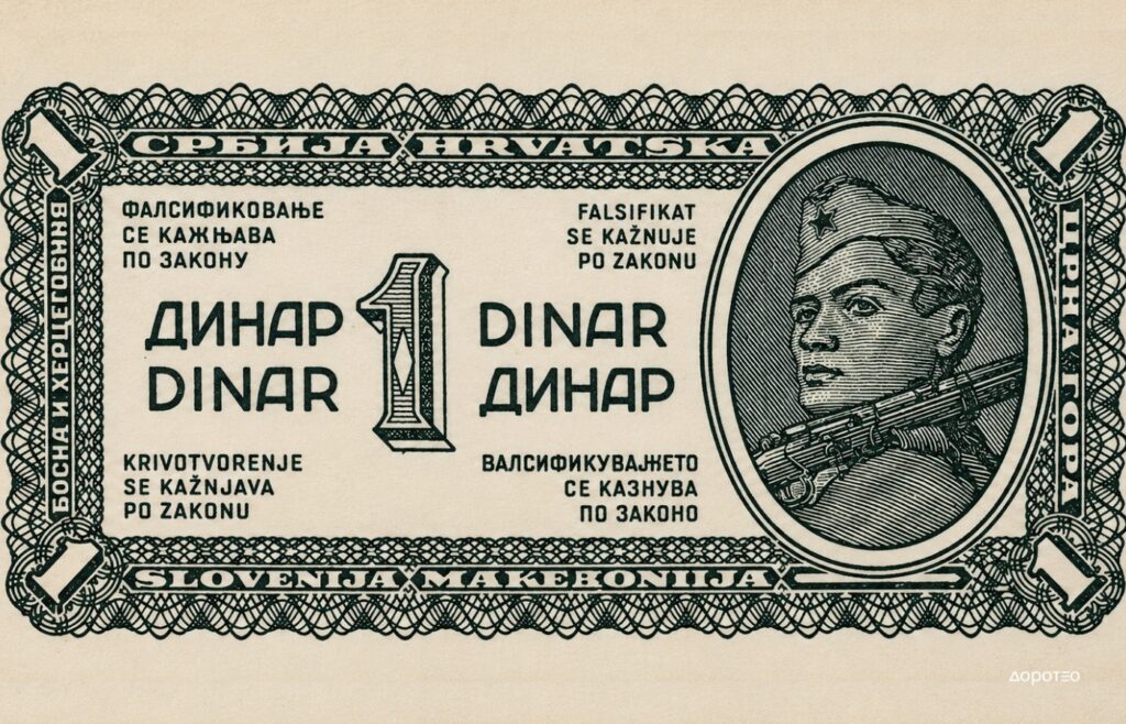
From the very beginning, the banknote was much more than a means of payment. It was one of the objects through which the new state made itself visible in everyday life. In her dissertation on the design of political symbols in socialist Yugoslavia, Koraljka Vlajo includes banknotes among the numerous artefacts through which she traces the visual manifestations of political symbols.
From Heroes of War to Heroes of Labour
Already during the first post-war years, the visual repertoire of Yugoslav banknotes began to expand. Alongside the Partisan appeared miners, foundry workers, lumberjacks, fishermen, peasants and women workers. The hero of war gradually gave way to the hero of labour.
The visual design of the 1946 banknote series was entrusted to Matija Zlamalik, while Veljko Andrejević Kun and Tanasije Krnjajić contributed to its engraved execution. Their names can also be read on the banknotes themselves: Zlamalik is credited with the design, while Kun and Krnjajić appear as engravers. The new state iconography was therefore not created anonymously – artists and engravers translated the worker, one of the key symbols of socialist society, into the graphic language of money.
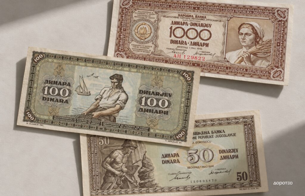
The message was simple: the revolution had created the state, and labour was to build its future. Physical labour, industry and agriculture became images of the new society.
This corresponded with the broader visual culture of early Yugoslav socialism. The worker was not depicted as an ordinary individual, but as an agent of social progress, while industrial plants, machinery and large construction sites became symbols of modernisation.
Arif Heralić and the New Face of the Yugoslav Dinar
A new phase in the design of Yugoslav currency in the mid-1950s was marked by Miodrag Petrović, an academically trained painter and technical director of the Institute for Manufacturing Banknotes. Petrović designed the entire 1955 series – the 100, 500, 1,000 and 5,000-dinar denominations – which introduced new visual solutions compared with its predecessors and was centred on the theme of the country’s economic development. One of the series’ most recognisable banknotes was the 1,000-dinar note, featuring Arif Heralić, a worker at the Zenica steelworks.
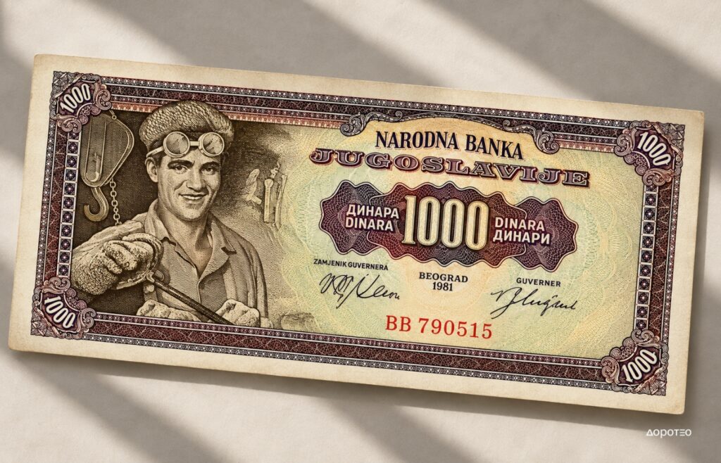
Heralić’s appearance marked an interesting shift from the first post-war banknotes. Instead of a generic, idealised worker, the currency now featured the face of a real person. Yet, through its reproduction on a banknote, this individual once again became a symbol – the face of Yugoslavia’s industrial working class. Heralić’s portrait remains one of the most striking examples of the relationship between photography, graphic design and state iconography in Yugoslavia. For his image, Petrović used as a model a photograph taken in 1954 at the Zenica steelworks by Nikola Bibić, a photographer for the newspaper Borba. Bibić later recalled that Heralić had caught his attention because of his striking face and smile, with no idea that the photograph would eventually appear on one of Yugoslavia’s most recognisable banknotes.
An interesting detail associated with this banknote is that Arif Heralić is still frequently confused with Alija Sirotanović, the famous record-breaking shock worker and miner from the Breza mine. Heralić, however, was neither a miner nor a shock worker, but an employee of the Zenica steelworks.
Sirotanović would only become associated with Yugoslav currency much later, with the 20,000-dinar banknote issued in 1987, which probably further contributed to the two working-class figures becoming conflated in collective memory.
From Socialist Realism to Yugoslav Modernism
During the 1950s, political iconography became more complex. Industrialisation, railways, agriculture and large construction projects continued to represent a developing country, but different kinds of motifs gradually began to appear.
Architecture, art, urban landscapes and cultural heritage entered banknote design. Among these was a work by Ivan Meštrović, signalling that the state’s visual identity was no longer based exclusively on revolution and physical labour. This transformation is particularly evident in Milorad Petrović’s designs. The banknote became a meeting point between graphic design and other artistic disciplines: the 5,000-dinar note from the 1955 series incorporated a detail from Ivan Meštrović’s relief The Kosovo Maiden. An existing work of art thus acquired a new function – moving from the museum and public space onto an object of mass everyday use.
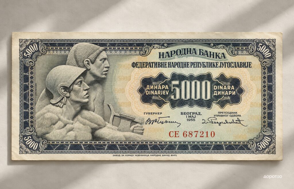
This was part of a broader transformation in Yugoslav visual culture – the transition from socialist realism towards a distinct form of Yugoslav socialist modernism.
The graphic language became less overtly propagandistic. Compositions grew more contemporary, while the banknote increasingly functioned as a carefully conceived system of image, ornament, typography and security elements.
Yugoslavia as a Modern and International State
During the 1960s and 1970s, Yugoslavia increasingly presented itself on its currency as a modern, technologically advanced and internationally relevant state.
Shipbuilding, industry, agriculture, science and art entered the visual repertoire of the Yugoslav dinar. At the same time, motifs appeared that could be associated with Yugoslavia’s international position and its policy of non-alignment.
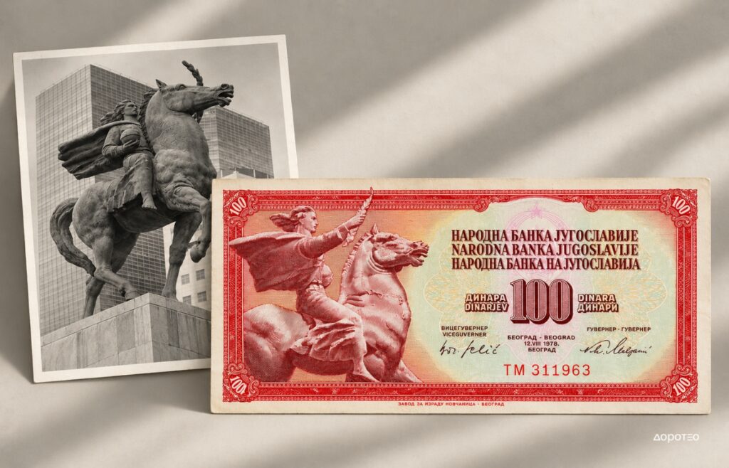
Among them was Antun Augustinčić’s Peace Monument, the original of which stands in front of the United Nations Headquarters in New York. This motif was also translated into the graphic language of money by Miodrag Petrović, once again establishing a connection between Yugoslav sculpture and banknote design. Such an image could simultaneously evoke Yugoslav art, peace and the country’s international role.
Nikola Tesla also appeared on Yugoslav currency, as a symbol of science, technological progress and a cultural heritage that transcended immediate political ideology.
Tito on the Banknote
Although his portrait had been present in almost every sphere of public life for decades, Josip Broz Tito appeared as the central motif of a regular banknote relatively late.
The 5,000-dinar banknote issued in 1985 was designed by Dragiša Andrić and Nusret Hrvanović, while Andrić and the Italian engraver Trento Cionini worked on its engraved execution. Its authorship reveals how the final appearance of a banknote was the result of collaboration between designers and specialised engravers – a process that often remains invisible when money is viewed solely as a historical document.
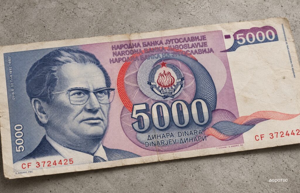
His appearance on Yugoslav currency during the 1980s – after his death – served a different function from the post-war depictions of Partisans and workers. Tito now belonged to the state’s historical memory.
Linking his portrait with Jajce and the Second Session of AVNOJ further brought together two key points in Yugoslavia’s political mythology: the leader and the founding of the socialist federation.
At a time of increasingly visible economic and political crisis, banknote design thus turned once again towards symbols of a shared history.
Inflation and the Last Banknotes of the SFRY
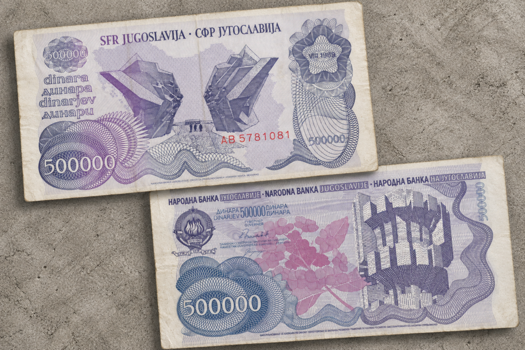
The end of the 1980s brought an entirely different dynamic. Inflation rapidly increased nominal values, and Yugoslav banknotes began to appear in tens and hundreds of thousands, followed by millions of dinars.
At the same time, their iconography changed. Alija Sirotanović, anonymous young faces, children and increasingly contemporary graphic solutions all appeared on the currency.
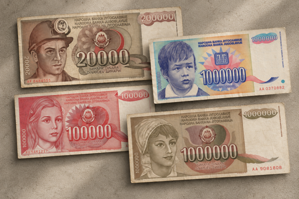
Dragiša Andrić and Nusret Hrvanović, already mentioned as the designers of the 1985 banknote featuring Tito’s portrait, continued to shape the visual identity of Yugoslav currency throughout the second half of the 1980s. Andrić designed the 20,000-dinar banknote issued in 1987, while Hrvanović and Dušan Matić contributed to its engraved execution. Andrić also designed the 100,000-dinar note of 1989, on which he additionally worked as an engraver alongside A. Dimitrijević. Their names can also be found in the small signatures on the banknotes themselves – discreet traces of authorship on objects that passed through millions of hands.
Within only a few years, the same circle of authors was designing currency whose denominations rose from tens of thousands to millions of dinars – the design attempted to maintain visual continuity while the value of the currency itself was rapidly losing stability. For collectors, this period is particularly fascinating. Rapid monetary changes produced a large number of denominations and variants, while the currency itself became a direct document of the economic crisis.
The final SFRY banknotes of 1990 and 1991 seem to search for a more neutral shared identity. Instead of Partisans, workers and political leaders, they feature children and young people, nature, science and monuments to the National Liberation Struggle.
Nikola Tesla and Ivo Andrić belong to this final attempt to represent Yugoslavia through figures and values capable of functioning beyond an explicitly Party-oriented and revolutionary narrative. The continuity of authors from the previous decade is also evident here: the 1,000-dinar banknote featuring Nikola Tesla, issued in 1990, was designed by Dragiša Andrić, who also engraved Tesla’s portrait. Andrić thus became one of the creative figures linking the visual language of the late 1980s with the final banknote series of socialist Yugoslavia.
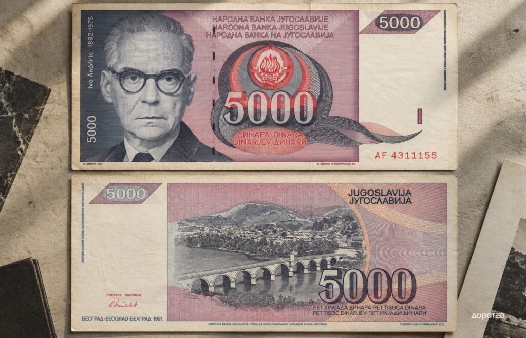
One of the country’s last major banknotes, the 5,000-dinar note issued in 1991, featured a portrait of Ivo Andrić and an image of the Mehmed Paša Sokolović Bridge in Višegrad. This banknote was also designed by Dragiša Andrić. Andrić and A. Dimitrijević worked on the engraving of the obverse, while Petar Medecijan and Radovan Obradović engraved the reverse featuring the bridge. A cultural symbol of endurance thus appeared on one of the state’s last major graphic products at precisely the moment when the political community itself was disappearing.
Yugoslav Coins: The State Reduced to a Sign
SFRY coins tell a somewhat different story from banknotes.
Regular coinage was visually far more restrained. Denomination, the name of the state, year and national coat of arms formed its basic repertoire. This makes coins particularly interesting for tracing changes in the country’s official name, coat of arms, scripts, materials, dimensions and typography.
While banknotes can carry entire miniature narratives, a coin functions almost as a state symbol cast in metal.
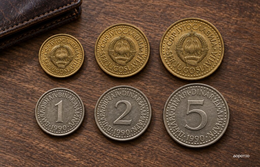
Its visual power derives less from illustration than from standardisation. The same coat of arms, the same typographic system and a clear differentiation between denominations create a recognisable system of everyday objects belonging to the same state.
Later series increasingly relied on large denomination numerals, clean typography and a clear visual hierarchy. In this sense, coin design can also be seen as an interesting example of the Yugoslav modernist approach to the mass-produced object.
Yugoslav Commemorative Coins
Yugoslav commemorative coins form a field of their own.
Unlike regular small-denomination currency, they offered far more space for representations of historical events, political anniversaries, cultural figures, sporting events and other themes.
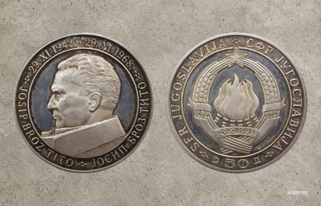
Here, the coin approaches the medal: it is no longer merely a standardised means of payment, but a small object of remembrance.
This is precisely why commemorative currency represents a particularly interesting field for collectors of Yugoslav design. On a relatively small metal surface, graphic and industrial design meet sculpture, state iconography and the politics of collective memory.
Yugoslav Currency as a Collectible
When SFRY banknotes and coins are viewed together, they reveal the changing ways in which Yugoslavia represented itself over almost half a century.
In the 1940s, its symbol was the Partisan. In the post-war period, it became the worker. Later came industry, science, art, cultural heritage and the country’s international position. During the 1980s, historical memory became increasingly prominent, while towards the very end of the state more neutral symbols appeared on its currency – young people, Tesla and Andrić.
For this reason, old Yugoslav currency is of interest today not only to numismatists, nor does its value rest solely on the rarity of an individual specimen.
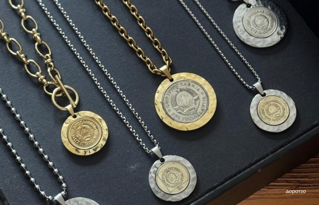
Banknotes and coins are small documents of their time, but they are also authored objects of design. A change in portrait, coat of arms, typography, material, colour or even the number of zeros in a denomination can speak volumes about the political, social and economic transformations of the country that produced them, while the signatures of Kun, Zlamalik, Petrović, Andrić, Hrvanović and other authors remind us that this visual language was the product of specific design and artistic work.
For collectors, this is precisely where their particular value lies: what is being collected is not merely paper or metal, but fragments of Yugoslavia’s visual history.


